P4, A Prosper loans exploratory data analysis
This will be the fourth project and fifth post from my ongoing Nanodegree in Data Analysis. This posts format will be a bit different since the report for this project was initially written in R-markdown using Rstudio and then converted into markdown before getting published so the formatting might look a bit different from time to time. The way it is written is also a bit different since it is more or less using a stream of consciousness to depict my thought process while exploring the chosen dataset. This means that except for the resulting graphs and reflections in the end this post might be a bit wordy since it is mostly unedited but I hope you will be able to bear with me.
For this exploratory data analysis, we are having a look at loan listings data from a web service called Prosper to try to figure out who is using the service, why they are taking a loan, and how much that loan costs. Since the original dataset contains over 80 variables I have picked out a subset which we will use for our analysis loosely based on the above stated questions. Initially, some light data wrangling was also made to either make the dataset more readable and to handle NA values. The goal is to in the end pick out three different to wrap the conclusion around.
Univariate Plots Section
Let’s start by having a look at the summary statistics for the data to see what we have to work with.
##  ListingCreationDate           Term                      LoanStatus
##  Min.   :2005-11-09 20:44:28   12: 1614   Current             :56576
##  1st Qu.:2008-09-19 10:02:14   36:87778   Completed           :38074
##  Median :2012-06-16 12:37:19   60:24545   Chargedoff          :11992
##  Mean   :2011-07-09 08:07:23              Defaulted           : 5018
##  3rd Qu.:2013-09-09 19:40:48              Past Due (1-15 days):  806
##  Max.   :2014-03-10 12:20:53              (Other)             : 1266
##                                           NA's                :  205
##    ClosedDate                   BorrowerRate     Occupation
##  Min.   :2005-11-25 00:00:00   Min.   :0.0000   Length:113937
##  1st Qu.:2009-07-14 00:00:00   1st Qu.:0.1340   Class :character
##  Median :2011-04-05 00:00:00   Median :0.1840   Mode  :character
##  Mean   :2011-03-07 20:21:21   Mean   :0.1928
##  3rd Qu.:2013-01-30 00:00:00   3rd Qu.:0.2500
##  Max.   :2014-03-10 00:00:00   Max.   :0.4975
##  NA's   :58848
##  EmploymentStatus   EmploymentStatusDuration IsBorrowerHomeowner
##  Length:113937      Min.   :  0.00           Mode :logical
##  Class :character   1st Qu.: 19.00           FALSE:56459
##  Mode  :character   Median : 60.00           TRUE :57478
##                     Mean   : 89.64
##                     3rd Qu.:130.00
##                     Max.   :755.00
##
##  CurrentlyInGroup DebtToIncomeRatio         IncomeRange
##  Mode :logical    Min.   : 0.000    $25,000-49,999:32192
##  FALSE:101218     1st Qu.: 0.140    $50,000-74,999:31050
##  TRUE :12719      Median : 0.220    $100,000+     :17337
##                   Mean   : 0.276    $75,000-99,999:16916
##                   3rd Qu.: 0.320    Not displayed : 7741
##                   Max.   :10.010    $1-24,999     : 7274
##                   NA's   :8554      (Other)       : 1427
##  TotalProsperLoans LoanOriginalAmount LoanOriginationDate
##  Min.   :0.0000    Min.   : 1000      Min.   :2005-11-15 00:00:00
##  1st Qu.:0.0000    1st Qu.: 4000      1st Qu.:2008-10-02 00:00:00
##  Median :0.0000    Median : 6500      Median :2012-06-26 00:00:00
##  Mean   :0.2755    Mean   : 8337      Mean   :2011-07-21 03:18:19
##  3rd Qu.:0.0000    3rd Qu.:12000      3rd Qu.:2013-09-18 00:00:00
##  Max.   :8.0000    Max.   :35000      Max.   :2014-03-12 00:00:00
##
##  MonthlyLoanPayment InvestmentFromFriendsCount InvestmentFromFriendsAmount
##  Min.   :   0.0     Min.   : 0.00000           Min.   :    0.00
##  1st Qu.: 131.6     1st Qu.: 0.00000           1st Qu.:    0.00
##  Median : 217.7     Median : 0.00000           Median :    0.00
##  Mean   : 272.5     Mean   : 0.02346           Mean   :   16.55
##  3rd Qu.: 371.6     3rd Qu.: 0.00000           3rd Qu.:    0.00
##  Max.   :2251.5     Max.   :33.00000           Max.   :25000.00
##
##    Investors       ListingCategory
##  Min.   :   1.00   Length:113937
##  1st Qu.:   2.00   Class :character
##  Median :  44.00   Mode  :character
##  Mean   :  80.48
##  3rd Qu.: 115.00
##  Max.   :1189.00
##
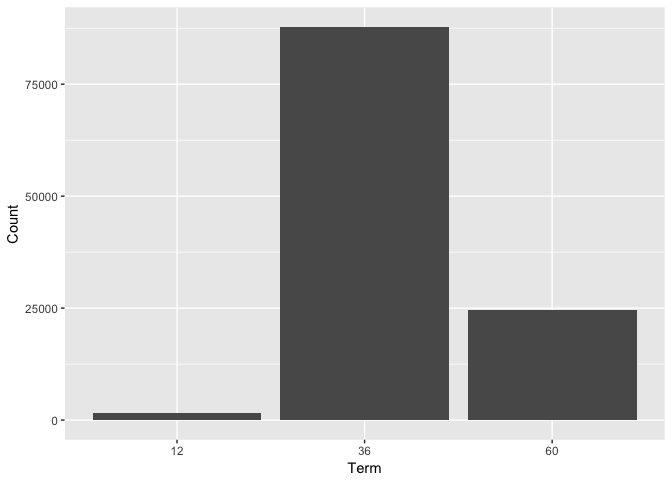
Based on the above numerical data our typical loan taker is a first time prosper user with equal possibility to be a homeowner as not, taking a loan over 36 to 40 months with an interest rate of around 19%. The typical size of a loan is $6500. Next, we plot the numbers of occurrences for the nominal variables in our dataset.
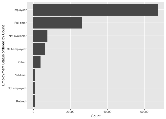

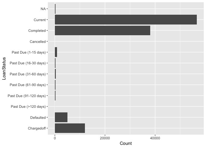
From the above plots, we can see that most of the loan takers are employed but the type of occupation is seldom given with the vague “Professional” and “Other” occupation types both being in the top ten. A majority of loans are still being repaid but there is also a substantial amount of past due, defaulted or charged-off loans.
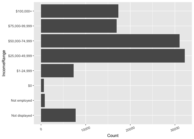
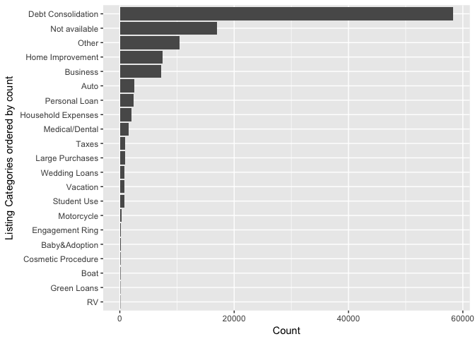
Further, the income range looks to be fairly normalized with an expected value somewhere around $50,000. Lastly, we have the listing categories for the loan listings and we can see that roughly half of the reasons given for the loans through prosper is debt consolidation followed by the once again rather vague “Not Available” and “Other” categories in the top three.
Now, after have gone through and had an initial look at all the variables in the dataset let’s revisit and plot some of the more interesting numerical variables to see how they are distributed over time.

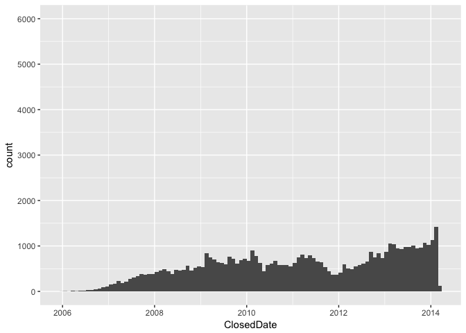


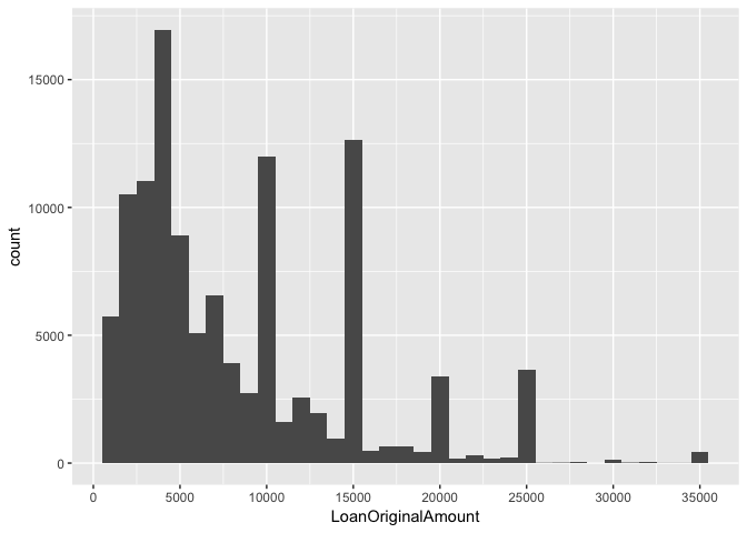


By plotting the above values we discovered some interesting facts such as that the loan term probably is locked at one, three or five years. We also saw that the usual amounts being borrowed are grouped around even $5000 numbers with a maximum at $35000. Lastly, the loan origination dates clearly show effects from the 2008 recession and also a peak in new loans later years which we still aren’t able to explain.
Let’s proceed with going over our findings once more before investigating inter-variable relations in the bivariate section.
Univariate Analysis
The original dataset contains more variables than what we could practically cover in one go, so to narrow them down we posed some questions about the data. Let’s revisit these questions to see if we made any discoveries worth noting already.
First, to see who is using the service we can look at the following variables mentioned:
- Employment Status
- Occupations
- Income Ranges
- IsBorrowerHomeowner
- etc.
Based on the summary data and plots presented, our typical loan taker is employed, with an unspecified occupation, and probably an income of $25,000 to $50,000. He/she is currently a homeowner and have debts of about a ratio of 0.22 of their income.
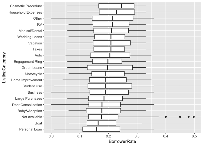
The reason for the loan is most likely debt consolidation with home improvement and business lying as distant seconds among the specified reasons as seen in the histogram with ranked listing categories.
To see what eventually happened with the loan we can have a look at the loan status bin plot giving an overview over the different statuses for all the loans in the dataset. Out of a little over 100,000 loan listings, we have a little over 10,000 that have been defaulted or charged-off(> 150 days overdue with no reasonable expectation of sufficient payment).
Loan origination dates vs. closed dates together with the data on overdue, defaulted, or charged-off loans. Using these features together with the above calculated active loans variable it would be interesting to dive deeper and see how, and when, the 2008 recession affected the loans taken.
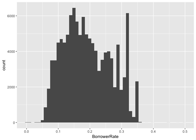
Another features worth looking in to is the borrower rates which mostly pikes my interest due to the unclear form of the distribution. Investigating what variables are correlated and how they affect this blob of values centered somewhere around 0.2 would be very interesting and perhaps a good candidate for analysis by creating a regression model.
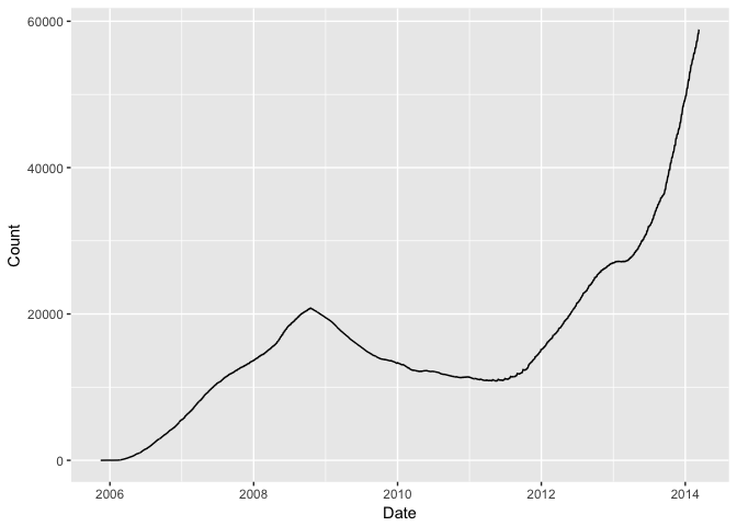
Using the Loan origination dates together with the closing dates I calculated a new variable called active listings to show the volume of current loans on the service. The calculation where made by taking the difference between originated and closed loans for each date during a period between 2005 and 2014 and the calculate the cumulative sum of those differences.
In addition, to make sure that all variables were read in using the correct data type, I also choose how to handle NA values. NA values for nominal data was substituted with a preexisting category best suited to improve the readability of following histograms. Numeral values were set to 0 for ordinal variables where NAs were present this in order to ease calculations in the analysis while not influencing other statistical measures.
Bivariate Plots Section
To continue following our interesting findings regarding the effects of the 2008 recession on active loan volumes let’s plot the change in loan statuses and listing categories for the period.


First, we can see that there has been some change in the gathering of the data in the shift between 2007 and 2008. Looking at loan statuses we can see that the ratio for Chargedoff and Defaulted loans did shift sharply with the amount of Chargedoff loans skyrocketing. Analogously, the listing categories went from mostly Not available to a mix of all different categories at the same period.
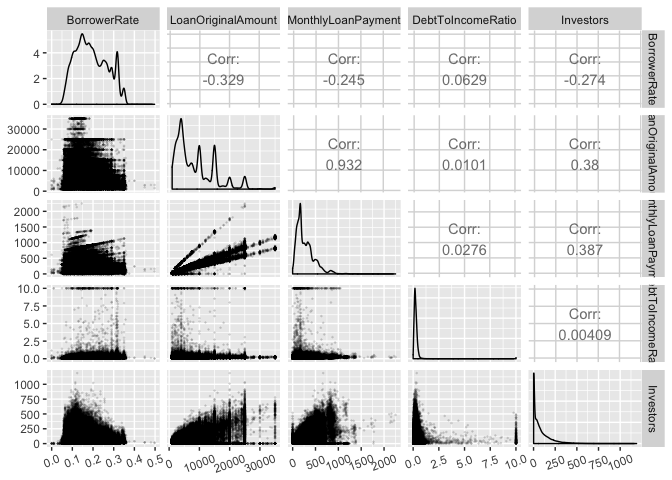
Looking at some of the numerical values in our dataset we, unfortunately, cannot see any meaningful correlation between variables, except for the connection between monthly payments and the original amount of the loan.
Following our slight drawback from analyzing the continuous variables we instead focus on the categorical ones. Here we can start to see some slight trends in the relationships between all our supporting variables and the borrower rate, however, not one single variable seems significant enough to draw any conclusions.


Bivariate Analysis
We first had a look at the ratios for loan statuses and listing categories to see if we could see any effects from the 2008 depression in our data other than the decrease in the volume of loans. In the loan status data, we could see an increase in the part of loans being defaulted or Chargedoff followed by a decrease in ratio when the economy recovered. For the listing categories, we saw that the biggest category has been and continues to be debt consolidation, except for the obvious gaps in the data during 2008, there doesn’t seem to have been any greater impacts on the types of loans taken through prosper during or after the time of 2008.
Turning our focus towards the borrower rate for loans I split up the visualizations into two steps depending on if the supporting variables were of a categorical or continuous type. First looking at the continuous variables we can see that the original amount of the loan, together with the size of the monthly payments and number of loan givers affect the borrower positively when increasing, there is a negative correlation meaning that an increase in either variable is connected with a decrease in the borrower rate for the loan. The only variable we focus on that increases the borrower rate is the debt to income ratio which shows a slightly positive correlation.
It is worth mentioning that none of the above relations did show any stronger correlation all having a ratio below 0.5.
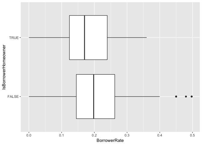
For the categorical variables, all of them pointed to correlations between the borrower rate and income, home ownership, term, occupation, and category of the loan. It would definitely be interesting to pursue the analysis of the correlation between borrower rates and these different variables further in the following multivariate section.
The only really strong relationship I could find in the above analysis was the relation between the original amount of the loan and monthly payments. This does seem a bit trivial though since you could come to this conclusion without any statistical analysis at all but it could be worth mentioning.
Multivariate Plots Section
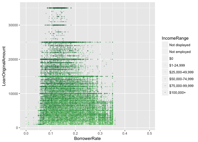
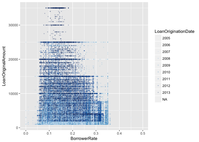
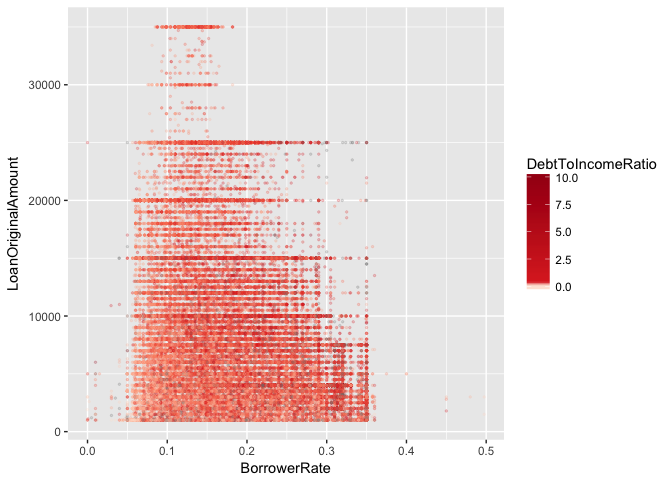
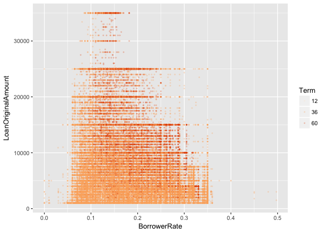
First, we take a look at the loan original amount and borrower rate in relation to income range, term, debt to income ratio, and if the borrower is a homeowner or not.

Next, we have a look at Borrower rates vs loan original amount with color coding for some different secondary variables.
Multivariate Analysis
From the group of scatter plots in this section, we can see that the borrower rate for a given loan amount increases together with a longer-term loan and also with the borrower’s debt to income ratio. We can see this since for any given value of loan amount the color is getting darker the further to the right we move. The inverse is also true for the borrower income range which shows that the borrower rate is generally lower for higher income borrowers given the same loan amount. Lastly, we have the year of origin which does not show any similar patterns, but instead, there is a step change in the minimum loan amount and maximum borrower rate. This is most likely due to a policy change at prosper taking place somewhere 2007-2008.
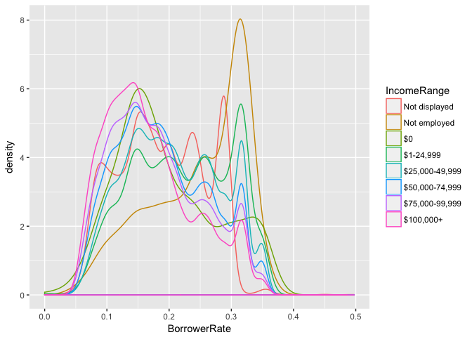
Moving on to the density plots we can see some interesting observations in the plot comparing borrower rate and income ranges. The not employed status is in general generating the worst borrower rate but surprisingly, not displaying anything at all is better and comparable to the lowest income range bracket. Something even more surprising is that $0 income shares roughly the same shape as income ranges from $50000 and upwards.
Looking at the borrower rate density for loan terms we can see that shorter term loans do get lower borrower rates but that there is a turning point somewhere after 36 months where the uncertainty from a longer term length take the overhand over other factors deciding the borrower rate. This can be seen in the lower variance for loans with terms up to 60 months.
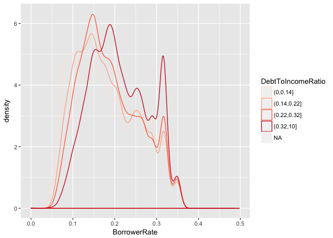
The debt to income ratio’s density is neatly sorted in an expected order with unreported and high ratios having peaks around 0.3 in borrower rates and lower rates having peaks between 0.2 and 0.1. The only thing standing out is that the fourth quartile (0.32, 10] almost has two equally high peaks at both 0.2 and 0.3. I believe this might be stemming from the fact that this span is the longest of the four quartiles. Most likely the distribution for the lower and upper half of this quartile has different distributions. (The fact that values over 10 are all clumped together at this value is also definitely a factor.)
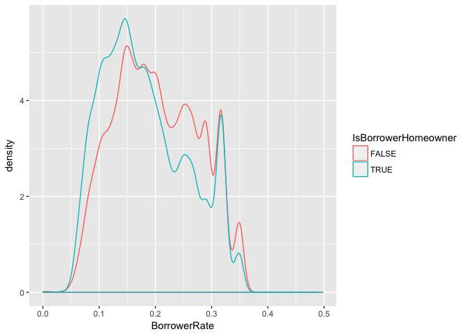
The last graph, showing the rates divided by homeowner or not has started out with as we might expect with homeowner density being higher at lower interest rate than non-homeowner later switching to non-homeowners being on top for borrower rates just before hitting the 0.2 rate mark. Interesting to see however was that at higher rates, 0.3 and above, being a homeowner or not does not seem to affect the rate at all. Perhaps loan-takers given this kind of rates has some other circumstances overshadowing the potential extra security being a homeowner could bring.
My initial plan was to try to create a linear model to predict borrower rates based on the variables I had chosen from the dataset but going through the analysis up until now I do not feel that I have been able to find enough data to make a decision regarding what would constitute a suitable model. Rather than trying to do anything based on loosely based assumptions I will leave modeling for another time.
Final Plots and Summary
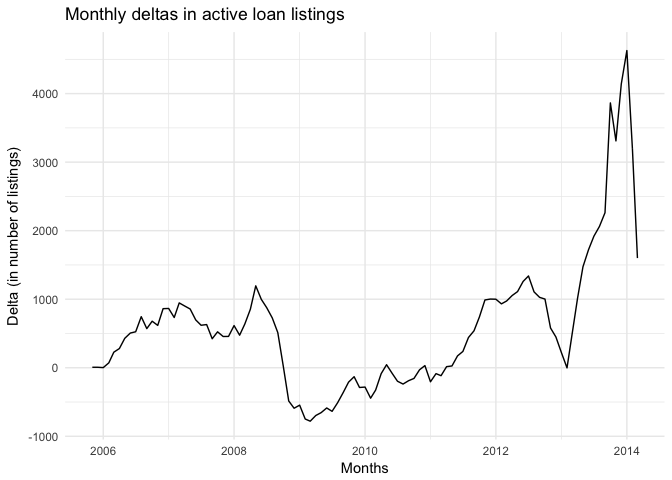
The first plot depicts the monthly deltas for active loan listings. The reason I choose this is due to how clear the effect of the 2008 recession can be seen. Not only did the increase of loans take a deep dive in the early half of 2008 but the number of loans actually decreased pretty much all the way into 2011. I don’t think any deeper conclusions can be drawn from this graph but it might be a good observation of how the market has looked like coming into the 2010’s.
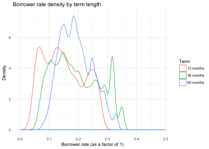
The second graph I choose was the density curve for borrower rates colored by term length. The reason for this is how the figure expresses the effect future insecurity has on decisions today. The variance is high for both 12 and 36-month loans but when the term increases further up to 60 months it shrinks. It is as if the insecurity of the future makes the borrowers decision for the borrower rate more uniform since there is less individual data they can count with.
I can also add that unlike the other two graphs, which I can image that I could have come up with even before taking the Udacity EDA course, this graph was something new I hadn’t seen, or perhaps paid attention to, during my years at university.
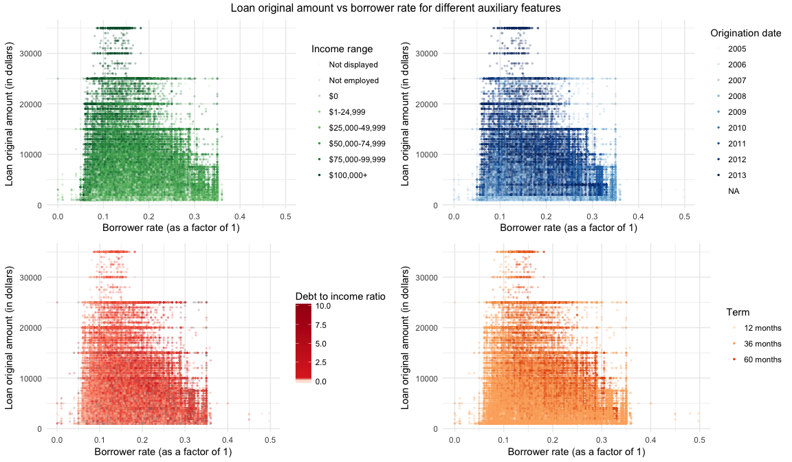
The third graph and this might be cheating, is actually a combination of the four different graphs depicting borrower rates vs loan original amounts with different coloring for the distribution of income range, origination date, debt to income ratio, and term for the loans plotted. Even though there weren’t any major breakthrough due to this figure this time, it does show that by trying combination after combination of different variables patterns are eventually found and sometimes you stumble over something unexpected. (In this case the origination date graph with a weird pattern.)
Reflection
This being the first time I had familiarized myself with R and Rstudio I do think that the analysis might have been suffering from time to time while focusing on how to use the tools rather than on what I was doing. Excuses aside, it was, however, a really interesting and fun exploration of the world of p2p lending.
I believe somewhere halfway through I did realize that trying to answer both questions regarding the lenders and the loans with less than 20 variables were harder than I first thought. Rather than trying to answer too much it might have been better to focus on just one of those two aspects, since the amount of information need to fully explore just one aspect were more than I first had thought.
I definitely think that going back and look at the prosper rating and a few more financial variables can result in a more in-depth analysis of what drives the rating. It would also be a good candidate for creating a model to fit to the data and validate it against the already existing ratings which sound like heaps of fun.