P6, Family status and grades in the PISA study
This will be the last post and project I do connected to my Data Analysis Nanodegree. The last project focuses on visualization and on using Tableau. The analysis itself will be contained in the above Tableau story I created, click the picture to access the story on Tableau Public, the below post will mostly focus on the process and my thinking behind it. A word of warning though this will not go into the practical details of creating the visualization in Tableau, just the thought process behind it.
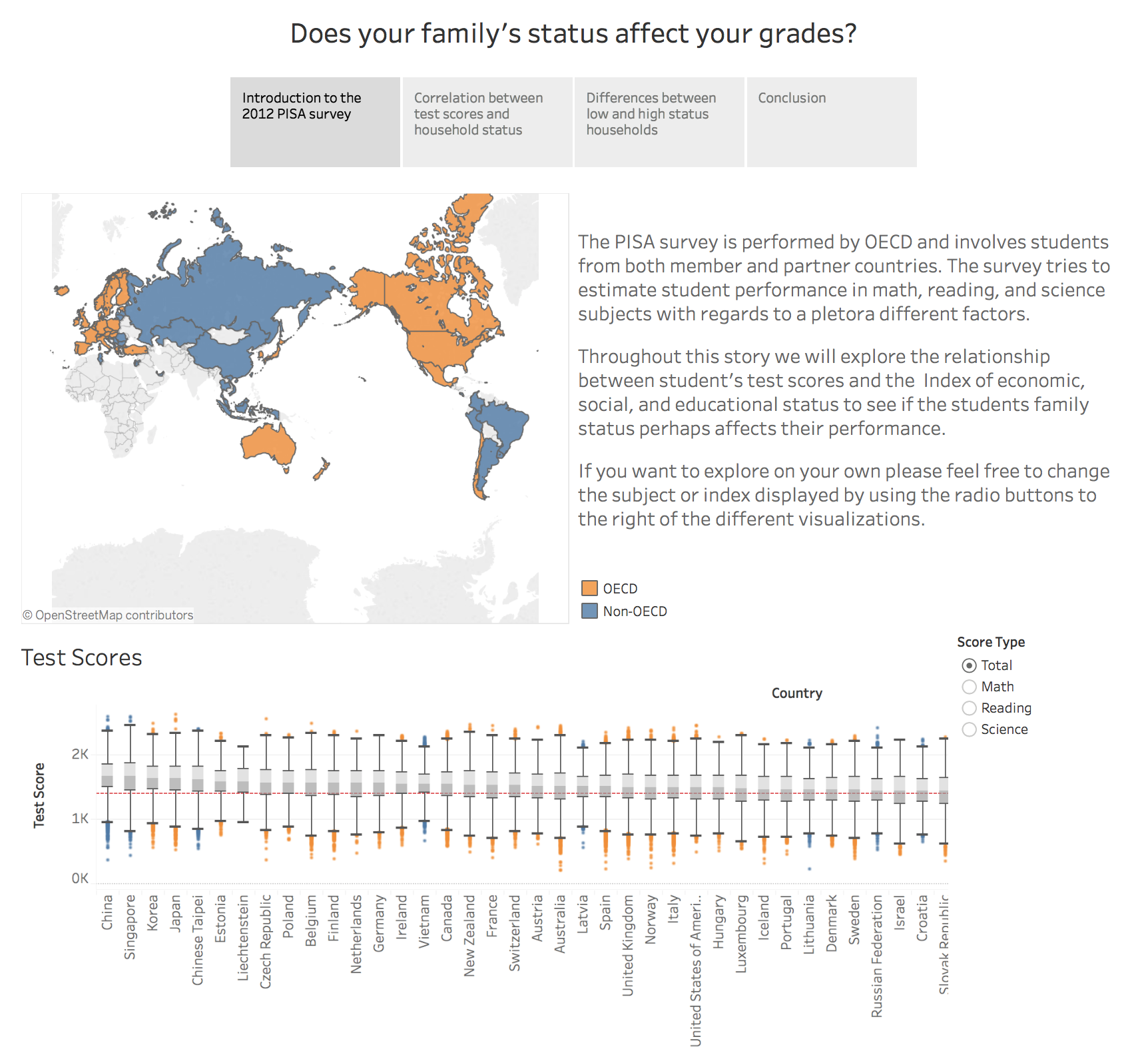
Using the PISA 2012 data set the above Tableau story focuses on the difference in student performance (test scores) depending on their families social, cultural and economical status.
It is shown that there are trends in the data pointing to a connection between things such as parents education, occupational status, and status possessions and their children’s scores in the survey.
For all the different countries surveyed, we can see that there is overall a 10% difference in test scores between the lower and upper halves of the student population with respect to the indexes explored.
Preprocessing
Before importing the survey data some preprocessing were made and a new .csv file was created from the original .csv file to avoid littering Tableau with unnecessary data that could slow it down. There where also some peculiarities, such as only parts of the United States being members of OECD and some regions participating as own entities rather than together with their related countries.
The code used for selecting the features of interest and consolidating countries and their respective regions can be seen here below. Also, as a last step of the script, we replace the cryptic codes used to describe each of the features originally with their corresponding explanation.
import pandas as pd

# Read in column names and descriptions for the columns of interest prepared in
# variables.csv
columns = pd.read_csv("variables.csv")

# Use the columns of interest in variables.csv to read in a subset of data from
# pisa2012.csv. Handling everything as strings for simplicity since we going to
# export back to csv anyway.
data = pd.read_csv("pisa2012.csv",
                   usecols=columns["Variables"],
                   dtype=str)


# Merge subregions for China, USA, Russia with parent region for better
# consistency.
def consolidate_subregions(region_name):
    known_subregion_flags = {"-China": "China",
                             "China-": "China",
                             "(USA)": "United States of America",
                             "(Russian Federation)": "Russian Federation"}
    for flag in known_subregion_flags.keys():
        if flag in region_name:
            region_name = known_subregion_flags[flag]
            return region_name
    return region_name


data["CNT"] = data["CNT"].map(consolidate_subregions)

# Setting all US data entries to OECD.
data.loc[data["CNT"] == "United States of America", "OECD"] = "OECD"

# Replace variable codes in column header with corresponding descriptions.
data.columns = columns["Description"]

# Export to csv that will be used in our Tableau workbook.
data.to_csv("data.csv")
Design
The story consists of an introduction and three main parts shedding light on the relation between the above mention status indexes and the student’s test scores. The text is kept to a minimum to keep the reader focused on the data and to make him/her draw their own conclusions from what they see.
There are four visualization types used throughout the story, a map, a box plot, scatter plots, and bar charts. The initial map and box plot was used as a way for the reader to get a quick overview of the data. Colors are shared, this is true for all visualizations in my story, to give a more coherent appearance and the box plot is a clean and efficient way to show a part of the distribution of values for each country.
On the second page, the scatter plot was chosen since I wanted to explore the relationship between the two continuous variables score and index. How much I tried to decrease the effects of overplotting I didn’t have any real luck so I added a bright red trend line to better highlight the trends in the data and draw some of the attention away from the orange blue blob in the background. The bar chart used for displaying the differences was a pretty safe and uninteresting choice to display the values for each country but by adding the total median value as a trend line, once again with the same styling as the scatter plot, it is also possible for the reader to see the total difference over all countries.
I felt it was important to have some element of interactivity in each of the different parts to make the reader more involved in exploring the data. I also made sure the trend lines in my plots updates together with reader initiated changes to enable him/her to make some rudimentary analysis on their own. My hope is that this makes the original message stick better with the reader and maybe it can lead to new conclusions I didn’t even originally intended to convey.
Resources
-
The PISA 2012 Technical report and PISA data analysis manual to get auxiliary information.
-
Tableau 201: Allow Users to Choose Measures and Dimensions for finding out how to create graphs where the reader could switch between different types of test scores and indexes.
-
Link to tableau public should you have trouble accessing the link in the image above.